Recent Posts

Tuesday, December 28, 2010

Looking... Sideways

Warning! This post contains images of nude figure drawings. If this is NSFW for you, you've been warned!


At the end of the year, "looking ahead" and "looking behind" seem to be the things to do. I'm taking a more conservative approach this year and looking sideways, like in my self-portrait up there, which was part of my Intermediate Figure Drawing final. Sometimes it's not about what you did last year or what you plan to do in the coming year, but more about how your current state might take you unexpected places. I've found that it's nearly impossible, at least when the semester is in full swing, to get anything I've planned to do done, hence why I'm not going to make any concrete predictions for the coming new year. I'd much rather take a few sidelong glances and see what's been happening and where it all might be leading.

What's special about the artwork I'm including in this entry is that all of them pulled me towards different places. I'm used to doing "good" drawings or paintings, but I'm not used to surprising myself creatively. As I've said before, I'm not always the most creative artist, because I tend to concentrate so much on realism and likeness that I don't bother with it. The following assignments forced me to take the time to be creative. And they ended up pulling me off sideways, taking me to places I hadn't expected to go.


The above charcoal drawing I call, "Bigger than I Am". It came about during the composition module of my intermediate figure drawing course, during which we were supposed to use light and shadow to design a figurative composition. Usually for figure drawing classes I just take a photo and draw it and not worry about composition. For this one, I ended up taking about 20 photos of myself in my exercise clothes lit by a clip-on lamp at about knee level. But when I got to drawing it, it started to mean something. Maybe something bigger than I am. It was a breakthrough for me in the application of the figure.


What that did for figures, the above gouache painting from Color & Design, our second big project, did for color. Before this painting, I'd always painted colors as I saw them. This time, I had a black and white printout of my composition and a limited palette of six colors. I never would have painted a blue-green rock or given the sea a touch of violet. But when I went ahead and did it, it *worked*. Granted, the above image was later tweaked - her hair is too orange, the shirt too purple, the skin too warm - and I'll upload a new version once I get it back from the school. But the thing was, I found out I didn't need to copy colors anymore - that I could make choices based on the entire mood I wanted to convey, use colors to set the scene, and still pull it all together and make it believable. Another breakthrough.


A bit later in Intermediate Figure Drawing, we were given a photo of a model and told to be creative with it. Now, I'd struggled some in the "exaggeration" model - I don't like to exaggerate or stylize if I don't have to. REAL REAL REAL!!! LIKENESS!! I admit to being a little caught up. So I paced around quite a bit with this one, staring at this guy curled up on a podium. What came across to me was this mood carried across in his posture, and the feathers came from there. I call it "The Shame of Flight." Every now and then a gift feels like a burden, doesn't it?

I've always thought that exaggeration or stylization would turn my figures into cartoons. But it could turn them into something else, perhaps not real, but just *as* real as I'm used to. That was another breakthrough, learning to use the figure to pull something absolutely unreal out of the ether and make it appear real.


This last one is the second half of my Intermediate Figure Drawing final. I'm honestly not sure if my figure drawing has improved that much from Spring semester, but what I do with it has certainly been freed up a lot. I think it helped to have a more open-minded, easy-going instructor who encouraged what I did right and graciously nitpicked what I did wrong (i.e. he told me the strings on the head and upraised arm should be taut - oh, I know, I know!) I mean, it's great to be able to draw figures, but even more inspiring to be able to DO something with them. And the more I draw them, the more I remember about certain bones and muscles, the landscape of the body, so it becomes easier and easier to do it every time, and easier and easier to apply those things to more creative pursuits. I still feel it's absolutely necessary to take some kind of figurative course every semester (I have anatomy coming up in the spring) but at the same time, the further I go the more confident I get.


This last thing I'm putting up here is my final project for Color & Design, my mandala. Being a bit of a Buddhist myself, when I found out we were doing mandalas as the final project I was all sorts of enthusiastic and interested, as I've actually thought of making them in the past. When we got to the actual project though, for some reason my mind went to trees. Maybe because it was late fall and they were all going to sleep; maybe because I have this weird obsession with preserving them... maybe simply because natural elements fall into place so nicely in a design. Anyway, I ended up with this Ode to Trees, with the old beech that grew on my grandparent's land featured in the center. It fell to pieces years ago after a heavy ice-storm and I've always wanted to do a piece of artwork for it. So, here we are.

I really don't know what to say about this piece. I'm posting it because I did a split-complementary color scheme right, about the most complex application of color we studied. I'm posting it because I created a balanced and interesting design with a clear focus point. I'm posting it because the thumbnails, lineart, 6" value rough, three 6" color roughs and the 10" final took more hours of tedious painting than I can calculate. I'm posting it because I did it and it was deemed successful.

It's so far off to the side of any work I'd planned to do this year, and any work I can imagine doing next year, but I learned a whole lot in doing it, which is what makes it so worthwhile. This past year has been tremendously frustrating in a lot of ways, as most all of my time gets sucked into doing the schoolwork above. I keep my fingers crossed for an eventual payoff in the future, but for the time-being, sideways we go, learning all the while.

By the way, I've got prints available of most of the above pieces at both Imagekind (fine fancy prints) and DeviantArt (less expensive prints and mugs and stuff), if anyone is interested!

Wednesday, November 10, 2010

Random Weird Things

I've been owing this blog a post for a while. For a couple weeks my Color & Design class was just murder, and then I had to... recover. There was one Monday in there that I did more in one day than I thought was ever humanly possible to do. The good thing about that was discovering I could do a whole lot more in a day if I really, really had to.

This was the big project:


I lovingly refer to it as "Blood and Absinthe." It's Rachel Weisz looking a little scary. Or a WoW-player's character Heulwen, as she described "Getting out of the shower very angry." Or something like that. I was going to make a long post describing just how this was painted, but it's really complicated and I'm not sure how much sense my explanation would make. It is painted, by hand, with gouache - red, green, white and black, mixed together to make 9 different colors. Well, plus the reds in the dagger. It measures about 7.5" x 10".

This is the outline which I painted using a combination of carefully cut frisket and painfully intricate brushwork:


As one of my classmates described it, it was "paint by number on crack."

And right now we're starting a second big design project that's just like it, except MORE COLORS. Huzzah. I *will* survive this class. I will.

Partly because we also get to paint fun little things like this:


PURPLE CATOCTOPUS WITH A FISH YESSSSSS.

The same week I was painting the final for Blood & Absinthe, we also had huge anatomical drawings due for my figure drawing class. Now, I love anatomical drawings, I really do. I love the detail and complexity and seeing everything underneath. But the last thing I needed that week were detailed anatomical drawings!! Even if they could be done very large and in charcoal. This was the week before Halloween, too, and it was just so creepy and appropriate. By the time I was doing these torsos, I was near crazy. I have a few memories of working on artwork - I don't know what makes some moments stand out - but working on these torsos while *exhausted* the night they were due, getting charcoal everywhere and living off the tunes Pandora kept pumping out (These were drawn to Lady Gaga songs, lol) will not leave my memory any time soon.


Creeeepy....

Since that midterm hump things have calmed down a lot. Doing things like hands and feet in figure drawing, and a lot of fascinating *content* in Color & Design that takes a lot to sink in. It all makes sense (light temperature affecting local color, atmospheric perspective in color, etc.) but it's pretty big concepts. The next project will be our second to last big one, then - hard to believe - we'll start working on our final project. I think as soon as next week we'll be working up ideas. Wow, time flies.

I'm really looking forward to the Winter break to do some things to apply all this new stuff. =)

I've started a morning digital painting exercise, too, that I'll post about as soon as I've got a few studies to show for it. It's so difficult to find time to paint on my own, I decided I should just do it as soon as I get up, and make it an exercise like taking a jog or something. Some ideas worked out and so far it's been lots of fun, even though I lost one yesterday due to static-shocking my computer. =O

I'll show them off soon though! Until then!

Tuesday, October 19, 2010

On Portraiture

Just a few quick things this week. I've had a bear of an assignment in my Color & Design class - two days straight of working bent over the drawing board with a tiny brush for 6-8 hours at a go. I am determined to get it right, but WOW has it been exhausting. Aside from all that though (the end result will be posted next week!) we were doing our portraiture module in intermediate figure drawing, which gave me the opportunity to do a nice portrait, something that doesn't come up all the time.

I got out the good charcoal paper for the assignment before I ever found my reference. There's something about portraiture that's just... *special*. It's an honor to put a person's likeness to paper. I don't get into all the stuff about "transferring the soul of the subject" or anything - I just want a good likeness, and a nice work of art. At the same time, it is intensely personal. I've been drawing portraits a long time. Over 15 years ago I started seriously trying to capture realism and likeness and personality in my drawings of faces, and I copied lots and lots of photos. But there's a big difference between copying a photo and creating a piece of art from the act of doing so.

You can't just draw an object when you're doing a portrait. I mean, every little thing an artist draws or paints is, essentially, breaking down the subject into shapes and lines and values and colors. It's very scientific and very impersonal. That's why our figure drawings aren't titillating unless we mean them to be. The figure is just another collection of lines and shapes and values. There's no difference between a breast and a coffee mug. And especially working academically, there's no deeper feeling involved outside of wanting it to look right, and the thrill of getting it to look right, whatever it is.

Again, I'm speaking only for myself. I'm sure other more passionate and expressive artists might disagree with me. But expressive art is a whole different subject.

But portraiture. Portraiture *has* to be personal. A model goes up on a platform, disrobes, and says "Draw this!" That's what they're there for. But a PORTRAIT. How often do you just go up to someone and touch their face? It's an incredibly intimate gesture. So much of creating art is touching, though transferred from the eye to the hand. So when approaching a portrait, I always come in humbled. Humbled that I would be allowed this intimacy and trust. It doesn't matter if the subject is some celebrity in a press photo or someone's photographs of their family or from life. A portrait is something special.

This week, I was looking for references for my Color & Design project when a photo of Rachel Weisz jumped out at me for the portrait assignment. It was very simple, very sedate, a profile with a lot of black and white contrast. This feather in her hat had a lovely way of curving down to match up with the curve of her jawline. I said, that's the one, that's the ref for this week's portrait. So I spent quite a few hours with Rachel, muttering apologies about how big I'd often mistakenly draw her nose, before finally ending up with a lovely portrait.


It was just SO PLEASANT to spend time doing such a thing this week. I have to draw arms and torsos next. Not quite so special.

While on the subject of portraiture, a couple months ago I was asked to do a caricature of the pastor of my mom's church, First Presbyterian Church of Clarks Summit (shameless plug since I'm not a member, but really, it's a great place up there!) It was for a big celebration event for some of major milestones, and the caricature was to be one of the presented gifts. Oh boy. Well, I've never done a caricature. I've always thought it's a cool thing, especially when you see folks set up on sidewalks and such doing them in 10 minutes for $20 or whatever. But I also think it's related to that gift cartoonists have, of being able to capture expression and likeness in a minimum amount of lines. I don't have that gift of efficiency, unfortunately. I had to draw a portrait, then work backwards to simplicity.

I didn't, of course, start with a portrait like the one above. Heaven's no - I would have presented that instead of the caricature if I did! I did do several quick sketches though, like any I would do, trying to learn the facial features and so forth and add them to the personality I'm familiar with. Then came the choices - what to accentuate? What to minimize? How to make the design work around it? I was very glad to be taking a design course right now, as I think it helped I had some of those ideas in mind. Anyway, I put everything together and drew it in pen and marker (terrifying unerasable media!) on layout bond paper, with a bit of graphite for shading. I crossed my fingers and handed it over, hoping it would be well-received.

Sadly, I only have one kind of shoddy picture of it, since I forgot to take one apparently before I framed it and handed it over.


I was really, really surprised by how many congregation members came up to me after the event and told me how well it captured their pastor. I was also really, really relieved! Because it wasn't just a picture. Even though it was a caricature, it was still a portrait, and I was still humbled and honored to draw it.

Portraits are just special like that.

Tuesday, October 12, 2010

So Much!


Warning! This post contains images of nude figure drawings. If this is NSFW for you, you've been warned!

Ah, the semester is in full swing, and it's amazing how intense and time-consuming schoolwork can be. Both classes are going well though. I'm learning tons in Color & Design and getting a lot of good practice in Intermediate Figure Drawing. Both classes are stretching me quite a bit, which is a good thing. Color & Design is like constant flashes of insight and wonder. I've taken some color theory in the past, but nothing like this. There is not enough time to experiment and practice the way I want to.

Look, I made a color wheel!


The trick is, that whole wheel was mixed from just six different tubes of paint (the swatches with dots over them). Now we all know that yellow and blue make green, but it's very different to gradually mix blue into yellow and "discover" greens, one at a time. It's almost like learning words, seeing how letters fit together to create a pattern that means something. Except it's colors fitting together to create a recognizable hue. And then you add to that black and white and mixing complements, etc. and it's all really very exciting.

Plus you get to do nice things like this monochromatic portrait. I used the same reference a while back in this blog for some painting, but I sure like it better like this, in lovely blue-violets and lilac:


So next up we'll be combining hues and values and so forth to do a portrait design, and I'm very excited about it. I've never had such a handle on color before - it's totally not the same as just matching what you see. There's so much more. It's hard to put into words.

And now to flood you all with tons of naked people!


The week before last we started doing full-value drawings like the one above, and I felt very confident about it. We also did this value portrait, which was great for forcing oneself to get a lot of charcoal on the page (and also great fun for using the kneaded erasure to lift it out again):


I think it was the week before that we copied a photo of this statue, too, which was also very good practice at shading and values, though the torso nearly drove me crazy:


So getting high marks on those, I was feeling pretty confident in my drawing skills and my charcoal technique. I also took photos as I went along for one of the exercises, so I have this nice step-by-step to share with you!

Step 1:

This is the hardest part, doing the actual drawing, putting a figure on a blank page. You can see a lot of my measurements and plumb lines here, and some corrections. I work in vine for this stage so I can brush it off easily, and try to use as many straight lines as possible.

Step 2:

Here I've outlined the drawing in charcoal pencil, and put in the basic shadow-shapes.

Step 3:

I then use a tissue to smear the charcoal all over the paper. Once everything is a gray mess, I pick out the highlights again with a kneaded erasure.

Step 4:

Here we go back in with the charcoal and work on the shadows. This step takes a very, very long time, as I go over everything, adding darks and smoothing them into midtones, then picking out the highlights again.

And here is the finished drawing:


Now that I have a handle on that technique, which seems to work every time (at least that's what the grades show!) I've started to experiment more with gesture and texture and more expressiveness. I hope it won't end up a detriment, as I haven't gotten grades back yet this week! But here are two more, with, I hope, a little added "oomph":


That second one, I'm really proud of. It seems to me to be more than just a figure drawing exercise, that it captures some moment or some emotion. Not bad for a drawing off a photo of a model!

So there's the past few weeks, and hopefully I won't let so much time pass before the next post here! There's some pretty exciting fun stuff ahead, so I'll try to keep track of it and post when I can!

Sunday, September 19, 2010

Second Week In


Oh, baby! A blog entry before the middle of the semester? Unheard of!

Up above there, you can see Koby, a little 12"x12" oil painting I did for some family friends. He's the first oil portrait I've done in about... 6 years. My technique was rusty, but my heart was in the right place. I meant to scan it before I gave it away, but I didn't, so one poor photo will have to do. As much as I fell back on some of my old habits (like never putting more than a millimeter of paint on the canvas if I can help it) I did try some new things as far as coloring and composition. The folks I gave it to were very happy with it at least, and I very much enjoyed doing it. I did put my palette away again last night, but I almost left it out. I will be doing more oil painting soon.

Speaking of color and composition, that's the focus of one of my classes this semester, Color & Design. I was lucky enough to get my instructor from Analysis of Form last Fall, so I'm super happy about that and so far the class has gone well. It's a very different, very interesting class. I took about a year of graphic design classes before starting Illustration at AAU, so I felt I was at least aware of the elements of design. I never got such practice with them, though, or such hands-on, crafty assignments. Everything gets painted or rendered by hand, with a lot of mixing and judging value. Our second assignment consisted of creating an interesting design and then coloring it in with 9 different shades of black pencil. Extremely tedious. Then we cut out these things and past them on pages to make a neat little Color & Design book.


It's been a lot of work, especially with the tedious crafting of everything, but at the same time a very good class. I've always felt very weak in my compositional skills so I hope this helps. I'll just have to start trying to *make* compositions instead of just drawing a subject, and see.

The second class is Intermediate Figure Drawing. Coming out of the direct-drawing Clothed Figure Drawing class from this summer, slowing down and starting over with gestures almost seems too easy. In the first week we did 30 various 2-3 minute gestures. Though there's always room for more progress and refinement, I'm beginning to feel like I've got the basics down.


I want to make my gestures *prettier* and more artistic, as far as line weight and such goes. Once the proportions are there and the movement and pose, that's really what makes a gesture stand out. After the 30 we did for assignments, the instructor said, "Now do 50 more for fun!" I need to start taking a half hour out of every day and just banging them out, as many as I can in that time, and get a real method and technique down.

Drawing genuine people is probably more important to me than anything else. People tell stories just by *being*. To be able to portray a character visually opens up so many opportunities for illustration, even if there is nothing else going on in the picture. And if there is more going on, more composition, more environment, props, storytelling, etc. the genuine, real person just tells the story better.

So I strive for that with every figure drawing I do. This guy below came out as one of the best I've done in a long time. I'm not particularly fond of the model, but we had to use him, so I did the best with what I had. It's one of the first figure drawings where using lines of rhythm really came through to me. I had these great big bows drawn on the paper before I ever started his body and limbs, and they somehow helped guide the pose. I've been taught about rhythm several times, but this was the first time it fell into place. Hopefully composition will click the same way sometime soon!


In the meantime, I have a World of Warcraft project from last summer that I'm intent on finishing soon, among other things, and then I'm going to hunker down and start doing character sketches for serious. I have not given up on my list of things from the summer! In fact, before I put the palette and oil easel away, I was thinking of doing a cat face next, and all that blue in Koby's painting reminded me I want to do that Yelena Isinbayeva piece. I have not given up on them!!

Scheduling my time remains as difficult as always. I am taking Sundays OFF work and schoolwork. Hence the blog post. I might even keep up with them!

Friday, August 20, 2010

Then Summer Did Me In


So. It's August 20th, and summer is almost at an end. It's amazing how fast it goes, and how things pop up to get in the way of plans. For me, it was summer semester classes with AAU - taking both Perspective and Clothed Figure Drawing online.

One of the big things about taking classes online is scheduling. Because you're not actually *going* to class and sitting there for an hour or two doing work, you have to schedule that time in yourself. The online classes make it somewhat easy by giving a nice 15-week outline, with a module full of content and assignments for each week. In a normal semester, it's not difficult to schedule in what day to read the material, what day to do the exercises, what day to watch the videos, what day(s) to work on assignments, etc. There are 7 days in a week, after all. In the summer semester though, each module only spans 3.5 days. With two classes, one of them involving projects that take a minimum of 10-20 hours, this becomes a little more stressful.

Okay, it was very stressful. It took up all my time. Pretty much every day between June 21st and August 11th, I was working on schoolwork. I did take a day off for my birthday. And the classes were extremely worthwhile and really overall wonderful. But wow, was it intense and stressful.

The drawing at the top is from my clothed figure drawing class, and I'll get to that in a moment. I want to talk about Perspective first. I've taken perspective classes before and had it covered in other classes, so I knew the gist of it, of one-point, two-point, three-point, atmospheric, etc. I could draw cubes in space. The beauty of this class was the depth and application of those familiar theories. For one thing, on almost every project, we applied light and shadow in perspective. For another, we were able to choose our own subject matter. This made me challenge myself much more than any "draw seven boxes" assignment ever could.

I wanted to draw my WoW characters and stories, mostly. It was great to be able to use them and get some fan art out of it. The first big assignment using isometric perspective (which I'd never used before!) I got to recreate the residence of my blood elf. We've been dreaming up this living space in game for three years now. Finally, we could *see* it.


Most of the work in this class was drawn in pencil, then inked with Micron pens and shaded with Prismacolor markers in a range of cool gray. I quickly wore out my markers, mostly because I was terrible with them. I fell in love with the Micron pens though, which brought out some lovely linework I had never known I could do. I've always been one to fully render, but using the pens finally allowed me to just work in line, and be more expressive in line, and free myself from shading for a while.


I also found myself able to fully realize a space, which for someone who has always been a "I'll draw the subject and forget about the background" person, was really amazing. Even in atmospheric perspective, not having to worry about vanishing points and such, I found myself pushing to go back farther and farther, and nearer and nearer. The drawing isn't anything to write home about, but the creation of space was liberating to me.


And to be able to show characters interacting within an environment was even better. To create a *scene*. Yes, it took a lot of work. The image below was built up over the course of four drawings, done on top of each other on tracing paper, slowly refining everything while being sure the perspective was correct. Then of course there were the 6-8 lighting thumbnails. Well worth it in the end.


I got to have some fun with things, too. It had been suggested that I draw Tinkertown, the gnome refuge in Ironforge, and some other WoW players had thrown out some ideas. So for the two-point vertical project I drew up some of their crazy, crowded tenements. Again, it took a lot of time. I think overall just the inking on this one took 6 hours. But I'd never drawn anything like it before. I never imagined I could.


Last but not least, our final big project was to create a storyboard or comic. I'm not a big fan of comics. I appreciate the artwork, but I have trouble reading them - there's some disconnect in my brain between looking at pictures and reading words: I want to do one or the other, not both at the same time. But I found more value in it while creating my own comic, and found it really terribly thrilling to create all these images that sequentially told a story. I worked like crazy on this, drawing as fast as I possibly could to get it all down, and I can't imagine now the kind of mad skills some comic artists have to spew out this stuff with deadlines. It really does almost demand that you have a kind of template for bodies and faces and such. Me, I'd rather spend the 30 hours on one well-rendered scene. These two pages were utterly exhausting!


That last project though, drawing all those people as quickly as I could with no time for references, really benefited from my clothed figure drawing class. I want to, from here on out, try to take a figure drawing class each semester, just to keep developing that kind of instinctive feel for the human figure, so I can draw it quickly and easily when I need to.

The clothed figure drawing class was a bit revolutionary for me, because it focused on direct drawing. I have always leaned on sketching basic structure first - the little stick man, or mannequin figure, to make sure my proportions and gesture is correct before I begin detailing the figure I'm drawing. This class threw that out the window and just said, "DRAW THAT PERSON." Start at the head and work down - or at the feet and work up if it suits you. Just draw. Just draw that person immediately and as quickly as you can.

For several weeks I boggled at this and struggled, especially with the timer ticking away beside me. Then it began to click, and I began to apply all the relationship lines and plumb lines and gestures and proportions in my head as I drew. And I found out I could JUST DRAW, which was an amazing boost to my confidence.


Most of the work in the class was done with charcoal on newsprint, so I really have very little to show. Most of the drawings were, in essence, just large, quick sketches. After Spring semester and the long, tedious figure drawing I'd done, of beautiful, fully-rendered bodies, I was a little disappointed not to have anything solid and developed to show. Near the end of the class I started drawing on layout bond again, just to have a few "finished" pieces to show from the class.


Composition still gets me, as in the above work. The drawing is pretty good and pretty finished, but the composition is kind of sucky and it was done for the module on composition. I'm hoping that the "design" part of Color & Design that I'm taking in the fall will help with that.


On the other hand, I'm very happy with where my figure drawing is now. For the most part we drew from photos, with some drawing-from-life thrown in, but I still tried to challenge myself when working from photos. The above drawing was done from two separate photos that I wanted to bring together into a believable scene. The girl with the sword was drawn from her head to her feet, then to get the proportions and relationships correct, I drew the girl with the staff from the feet up. I honestly didn't know I could do such a thing and get a decent drawing from it!

Last but not least is my final from clothed figure drawing, using myself and my mom as models. She posed a lot for me during the class, so I thought I owed her some payback, in the form of a nice Rockwellian image of me presenting that long-awaited diploma. OH is she surprised! Well, we tried. It's actually very difficult to pose just right, and a lot of time in this class involved taking reference pics. So, two months of intensive work for a new understanding of space, a huge amount of fresh confidence in drawing, and a whole new bucket of tools. It almost drove me crazy, but was well worthwhile!

In the fall, I have intermediate figure drawing and Color & Design to look forward to. I'm really hoping that those two classes help me polish up a lot of my weaker points, like composition, natural, interactive and intuitive poses for figures, and of course ADDING COLOR. By spring of next year I'll officially be a Junior, so things should really start hopping.

In the meantime, I still want to do all the things I mentioned in my last post. I still want to do some oil paintings, some cat faces, and yes, Yelena jumping to hang over my couch. I have a baby portrait oil painting that is first on the list, however, but I'm going to try to keep drawing and sketching, especially using the Micron pens with linework. I'd very much like to get a nice, quick, "easy" way to sketch characters together in order to offer some low-cost commissions. It's taken a while, but I'm finally beginning to be able to pare down my tedious, time-consuming over-rendering habits.

Might just make an artist out of me yet. =P

Wednesday, June 2, 2010

Best Intentions

It tends to be a lot more likely I get things done when I commit them to writing, so here I am to describe what I hope to be producing in the next month or two. I've sort of been letting these ideas evolve in the past week while I did a lot of cleaning/organizing (which I'm still not done with) but I'm getting to have time to start working on them seriously. In the meantime I've been doing a lot of experimental practice sketching, mostly just seeing what I've learned that has stuck and what I need to work on, and what the most useful techniques are. It's funny how you sort of have to "compile" the skills after the fact, and see how they fit into your own processes and techniques.

Anyway, the Summer Art List:

  1. The Big Project: I've used photos of amazing and stunning Russian pole-vaulter Yelena Isinbayeva for reference for one of my WoW characters for a while, which always makes me feel a bit guilty. So in return, I'd like to do a painting of HER, doing what she does best, magically leaping very high. I have in my closet a 20"x48" canvas that's been sitting there a long time, and I think it would be awesome to do a monochromatic value painting of her, in a good deep blue, with maybe a few red highlights. I've started doing some preliminary sketches off photos, but it's going to take a while to get together the right pose, lighting, and background. I'll probably be doing a charcoal or two, maybe even one full-size, before I start to paint. I don't expect to get it done before maybe August.

  2. Cat Faces: I love painting cats. I've mostly done it in Photoshop and Painter, but I just bought two 8"x"8 gallery-wrapped canvases and I'd like to try it in oils. I also want to focus in and do *just* the face, on that square format. It's a little like "Green Eyes" below, but I want to zoom in even more, so it's just the cat face.


    I would love to do more cat commissions, but I think what scares people away is the digital format I've been working in, and also all the fiddling with different reference photos and getting poses right and so forth. If I can just work from one good photo and make a unique little oil painting, it might be something people would more likely go for. I'm going to be doing two of our dearly-departed kitties for the two canvases I have: Peter, who was a silver tiger and had a gorgeous striped face with a ruddy nose, and Maggi, my mother's adorable, round-eyed tortie-and-white. Not only will they be nice samples, but I will certainly find a good place for them to hang in the house, and when I can manage it I will do Bruce (above) to match.

  3. Last but not least is a little experimental project I want to do, surrounding a lot of nature photos I've taken and a batch of little 5"x7" canvas boards I recently bought. After finally getting the gist of what Impressionism is all about in my last Art History class, I want to try to loosen up and do some painterly, impressionistic paintings of ... natural things. I was going to devote myself to trees, but I might just pick out a number of interesting photos and paint from each one, and see what happens. At very least I'll hopefully make some things along the lines of "Rocks, Wind and Trees" but more focused and more a snapshot than a landscape like that.
So those are the personal plans - I also have a logo I'm currently working on and a big drawing I have to do of my WoW raid group for our get-together in August. My intersession course started yesterday and WOW is it compacted. 15 weekly modules over the course of 18 days, so generally one module is gone through a day. I was hoping it would be something I could do quickly each morning, but these past two days it's taken me two hours to get through all the material and assignments!

Anyway, there are my plans! I will complete them! And I will make updates along the way!

Tuesday, May 25, 2010

At Last!

Warning! This post contains possibly NSFW nude figure drawings! Proceed at your own risk!

Spring semester at the Academy of Art University ended on the 22nd. I handed in my last figure drawing and my sculpted clay portrait head, made sure everything was tied up neatly for my Art History classes, Facebook'ed a few new friends and closed the sessions up for good. One of the little cons about online classes is that once they're gone they're gone - no textbooks or handouts you can keep, unless you copied and downloaded quite a bit as you went. It's just all *poof* gone, along with all the names and faces and comments and discussions along the way.

The longer I'm at AAU the more I regret that, especially in regards to the module content. I did save a lot of the models from the figure drawing class, as they'll be excellent to practice from again and again.


The gist of it, of course, is always, "What did you learn?" Hence the reason why I'm taking classes anyway. The biggest thing I learned in Figure Drawing was this: Get it right. Get it right at the beginning, at the start, and don't move on until you know it's right.


That guy above took a long time to get right. And a lot of checking and correcting and fixing again, all in horribly scribbly vine charcoal before I ever went near the page with anything permanent. It's amazing though, how much you can depend on that scribbly mess of lines when you know they're right. Then you can just relax and just go over it and find the values and details and style the lines, etc.

The hardest part of a drawing is the first half hour.

In Figure Sculpting, it was all about what lies underneath.

I've drawn lots of skulls. I've drawn "planar heads". But I didn't *get* it until I sculpted them. I didn't get things like the ridge around the outside of the eye socket or how the cheekbone flows back to the ear. These are things you can *see* when you look at a face, but understanding what's underneath makes it so much easier to draw.


We did a lot of full-figure work, too, but I was just too clumsy with the clay to get as much out of it as far as learning underlying structure goes. I did get a much better sense of the hip mass and the chest mass and how they are connected, as well as some nifty things about shoulders (the egg-shape of the chest mass with shoulders then attached, instead of an upside-down triangle of chest mass with arms stuck on the top).

That kind of understanding helped a lot when drawing poses like this:


And this:


It's funny how you come to see the chest/ribcage area as kind of... not well-attached to the hips. But it allows for all kinds of tilting and rolling around and such, letting the abdomen be all springy and twisty in the middle. It's something I want to do a lot more practice with.

And then, of course, we have the back:


Which is still very complicated to me! Shoulder blades have lost some of their mystery though. Overall, both classes helped demystify the human figure for me quite a bit. I feel a lot more confident now, and know that if I'm careful and check over things and keep a lot of what I've learned in mind as I draw (and practice practice practice!) I'll be able to keep things together, and better yet, put together figures from various references and such for original poses.

Lastly, I had some huge revelations while taking my Art History through the 19th Century class. I've always been one of those academic naturalism snobs. There, I admit it. I was the person who thought Bouguereau was all that ever needed to be, utter perfection, and everyone should aspire to paint like that. Maybe it was seeing the whole progress of art from the Renaissance to Impressionism, or maybe it was learning how varied things really were, but I really found my mind opened to different styles and techniques. I can't say I love *all* Impressionism now, but I do love a lot of the Realism painters and some that came after, and I have a greater appreciation for texture and color and painting light through color instead of value. I also have a greater appreciation for preserving line, right in contradiction with my new appreciation for more painterly brushstrokes. So I'm very curious what I'll do when I start painting again.

All I know is that I *might* allow myself not to labor over every brushmark and making sure every outline is totally rendered over!

Anyway, I wrote my final term paper on martyrdom and Goya and Ribera, and if anyone would like to read it, I have it online here. Don't steal it!!

Yesterday I bought a half dozen little 5"x7" canvasboards and two 8"x8" little gallery wrapped squares. I have a week off still before my intersession class starts (20th Century Art History) and still a dozen things on my to-do-before-then list, but I am absolutely certain I will get to painting SOON!

Monday, April 19, 2010

These Hands


Often, it seems, people want to avoid drawing hands. Put them behind a leg, or in the grass, or behind a head, or wrapped in fabric - just somewhere, anywhere they don't have to be drawn. Hands are complicated. People have a torso and two legs and two arms and a head. A hand has an arm and a wrist and a palm and four fingers AND a thumb. Not to mention knuckles and fingernails and all those intricate wrinkles and veins and sometimes even fine little hairs.

Like portraits, hands are expressive entities within themselves. How often has a hand carried more gesture and meaning than a face? Second to eyes, they can be used to express so much... if they can be drawn well.


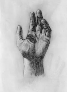
The two drawings above were done for my current figure drawing class. The first was from life, of my own left hand, which was an incredibly awkward way to draw. The second was drawn from a photograph of my hand, and having the photo-reference allowed me to comfortably work over it for a longer time. These were done with charcoal on layout bond, a paper I'm liking more and more the longer I use it.

The big thing is, no matter how much anatomy you go over or how deeply you understand the various tendons and bones of the hand, it's drawn like any other thing. The knowledge of anatomy helps guide your eyes around the various landmarks - we know how the thumb is kind of like a turkey leg, with that big meaty part in the palm, and we know basic arc of the knuckles from one finger to the next. But as the hand twists and turns and moves about, we're forced to sight and measure it like any other object. Thankfully, with all those flat planes and long structures, the hand gives itself over to measurement really rather well.

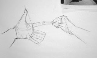
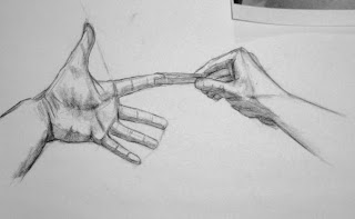
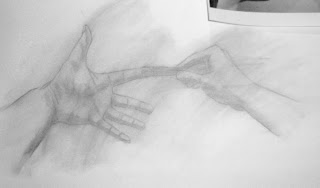
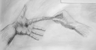
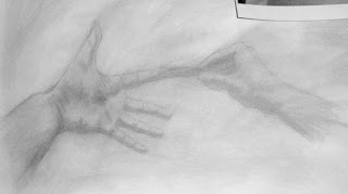
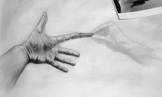
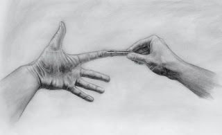
I took photos as I drew my third project for the week, which was to be two hands interacting. I had some fun getting a reference photo of my right hand clipping a clothespin onto my left, giving them some emotion and expression. Like God granting Adam the touch of life, but OW!!! I worked on 18"x24" layout bond with vine charcoal and soft charcoal pencils.

The first step, as always, is the straight-line block-in. This is the most difficult step of any drawing. This is the foundation. Every angle must be sighted and every length must be measured. I used the length of the clothespin to measure everything else. This was all done in vine, which brushes right off the layout bond like it never existed.


Once the basic vine drawing looks accurate and clearly defines the two hands, I got out my sharpened 6B charcoal pencil and went over the outlines, following some of the more subtle curves and details of the forms. I also blocked in the basic shading, very loosely.


Then I ruined it all with a tissue by smearing everything around.

Actually, this is very important when working with charcoal, as this is where we do two things: cover our mistakes, and build up a midtone. By wiping out all the prior work, we also wipe out the plumb lines and various other lines used to build the sketch, and we give the whole drawing a nice layer of light grey.


Time to outline and shade again! Mostly shading this time around, being a bit more careful and detailed in the shadow areas. These are going to be the deepest shadows, the ones that really bring out the forms.


Then we wipe it out AGAIN. Really?? What??? What did that charcoal ever do to you? Well, I want a good midtone. Midtones so often get overlooked, which causes things to look severely lit and lose a lot of "roundness." So I like a nice medium gray. Now the fun begins.


Dudley is already having a lot of fun, see? =D


With the kneaded erasure sculpted into a thin wedge, the light areas and highlights are picked out. Any area that is not *absolutely* white gets smeared with my finger again to tone it back. What we're doing here is letting our five values gradually build up and blend together without a whole lot of effort on our part. When the lighter tones are in, the forms and details really begin to pop out.


The last stage is the longest and most tedious, especially depending on how much time I have and what kind of mood I'm in. Going back with the soft charcoal pencil, the outlines are carefully reintroduced, the shadows are deepened, and the details are brought to life. The tissue and the erasure come back into play, and there's a lot of finger smearing. It's all just plain diligence and a good bit of luck as to how the charcoal will lay and how the drawing when come together.


About 3-4 hours after the sketch was starting, the drawing is all done. I've been going over the smeary background a bit with a shamois, but there's not too much that can be done about it. For an academic drawing, though, it kind of looks appropriate.


In the end, hands are no more a mystery than anything else; they just demand time and attention. And they're so worth it when they come out right, so expressive and such bearers of humanity. So now and then, it's good to lift them out of the grass, or put them out in front of the clothing. It'll be worth it. =)